My husband, Conor Biddle, is one of Ireland’s best lighting designers. A number of few years ago, I made a website for Conor as a Christmas present, along with a small bit of branding work.
However, retrospectively, it wasn’t very good. It was built using a Themeforest WordPress theme (that’s ok) but, back then, I barely knew what I was doing. The theme was built using Foundation – never mind Bootstrap – and it was a bit of a bloated mess by the end of it. It was slow and over complicated.
The logo was also no longer fit for purpose. I was quite naive with my execution when I originally did it. I thought it’d help him stand out in an overly corporate world but now I don’t believe it suits the industry. Conor preferred to go towards a simple, functional wordmark without much to distract.
The Task
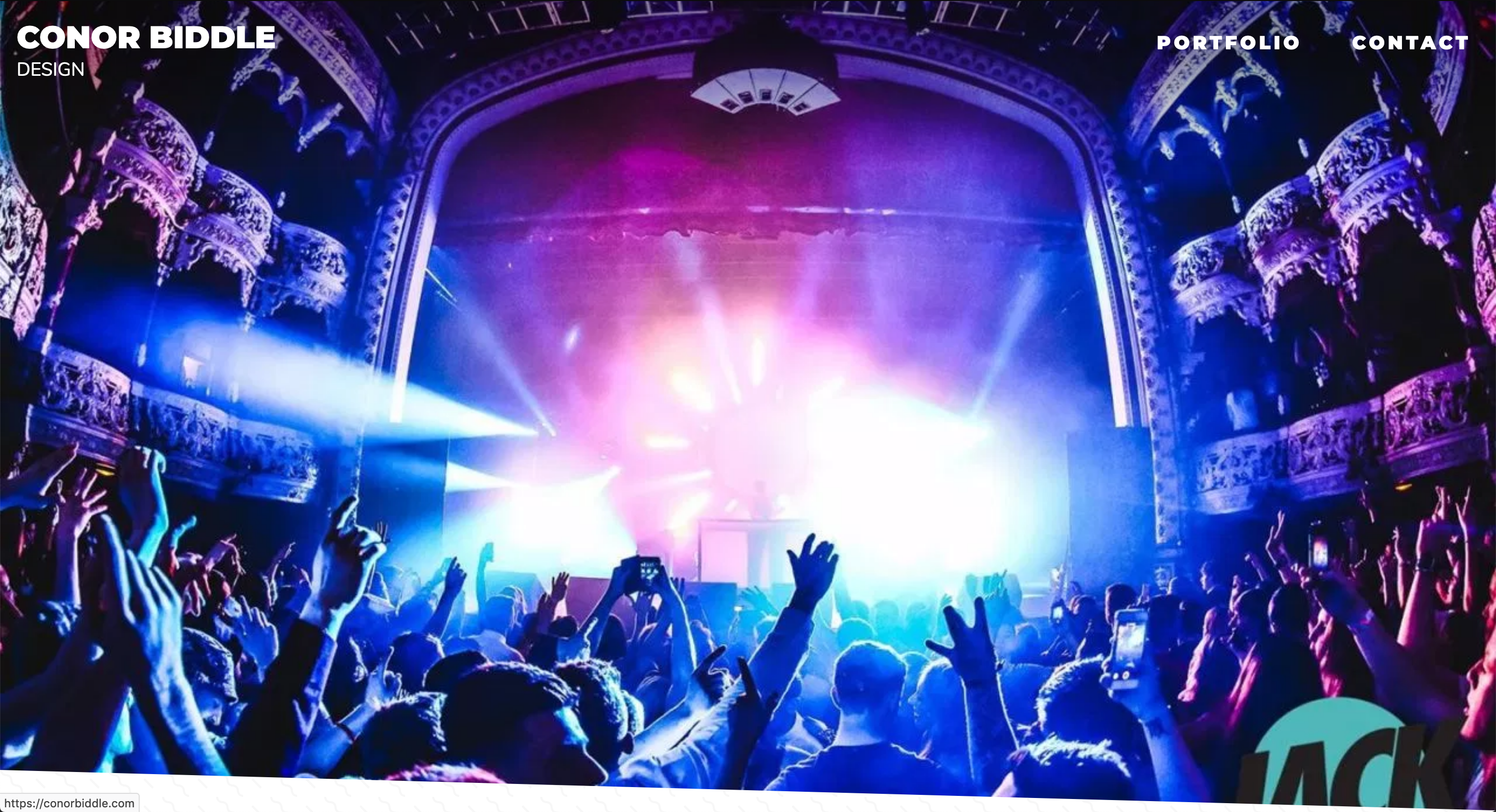
Conor wanted a minimal site that let the photography and videos do the talking. He opted for a monochromatic look but it’s also vitally important that the new site is easy for Conor to update. He didn’t want to have to write essays for each post. Ideally he’d just fill in some details about the project, upload some photos and that’d be it.
He also loved the idea of full screen images. Photography is key to the service he provides – it’s the selling point, so it makes no sense in squeezing the images down, lessening their impact.
- Minimal & Monochromatic
- Easy & Quick to update
- Cull down the content. The “blog” is no longer needed.
- Full screen images
The Research
Conor shared links of international design studios, world famous stage designers and a few sites that he liked the look of. I’ve included a few of them below but they were very useful to demonstrate what direction we should go in.


The Sketches
Below are a few sketches / wire frames I came up with as a possible solution for the site. These changed over time but it was very much a jumping off point.


The Mock-ups
So I booted up Sketch and got to work.
I showed the below mock-ups to Conor to see where we should go next and he gave me some feedback that’d bring it more in line with what he was thinking. I wasn’t precious about this process at all. It’s his portfolio to show to his potential clients. As long as it looked good and it worked well from a user experience standpoint, I was happy.
He wasn’t overly pushed on the colour in the logo / footer at all so I veered towards grey scale after that.


The Execution
CodePen
I did static HTML version of the site on CodePen as a starting point which you can see it below. It’s incomplete but you get the idea 🙂
See the Pen
vMJayB by Sean Smyth (@sean_smyth)
on CodePen.
I used a combination of CSS Grid and Flexbox of the layout. Among other things, CSS Grid makes it so easy to overlap elements on top of each other. Previously, this’d be position:absolute territory but that can get quite messy over time. I’ve only done some small projects using CSS Grid and Flexbox so the more practice I get with it, the better.
I didn’t feel the site needed a dedicated “Contact” page when it can just live on all pages in the footer. I also didn’t need a “portfolio” page as each page on site has a portfolio section already. If you’re on the homepage, the portfolio is mid way down. If you’re viewing a single portfolio item, the rest of the portfolio items are displayed below the content.
Because of the lack of pages, I didn’t need to worry too much about navigation or doing the typical thing of having a hamburger menu on mobile. There are only two nav links, [Portfolio] & [Contact], and clicking either of the nav items simply smooth scrolls you down to the relevant section on the current page. Obscuring these behind a hamburger seemed unnecessary.
WordPress
It was important for me to keep this on WordPress. It’s my most comfortable CMS but I also didn’t want Conor to have to learn another back-end. WordPress was good for this job but I didn’t want the bloat of a paid theme. Themes only need to be as complicated as you want them to be, so I built one from scratch.
Underscores Theme
Well, from scratch… I used Underscores as a starter theme. I ended up deleting a lot of the included template files, as this site was never going to use them. It didn’t need category pages, single page template etc etc. This new site was going to have two pages; homepage.php and single.php. I simply used the HTML template I had made, split it into reusable modules and thus a theme was born 🙂
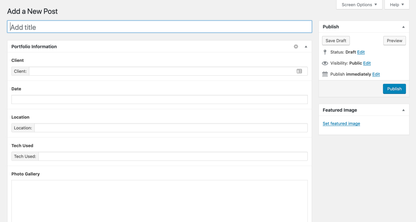
Advanced Custom Fields
I used the Advanced Custom Fields plugin for the first time with this project and it was an absolute dream. It’s so easy to set up and output data on the front end and saved myself a lot of time creating custom fields myself. The plugin also allows you to hide other, superfluous fields in the backend so the post creation process is as simple as it can possibly be. As you can see below, it’s just a matter of filling in a few fields and hitting “Publish”. Simples.
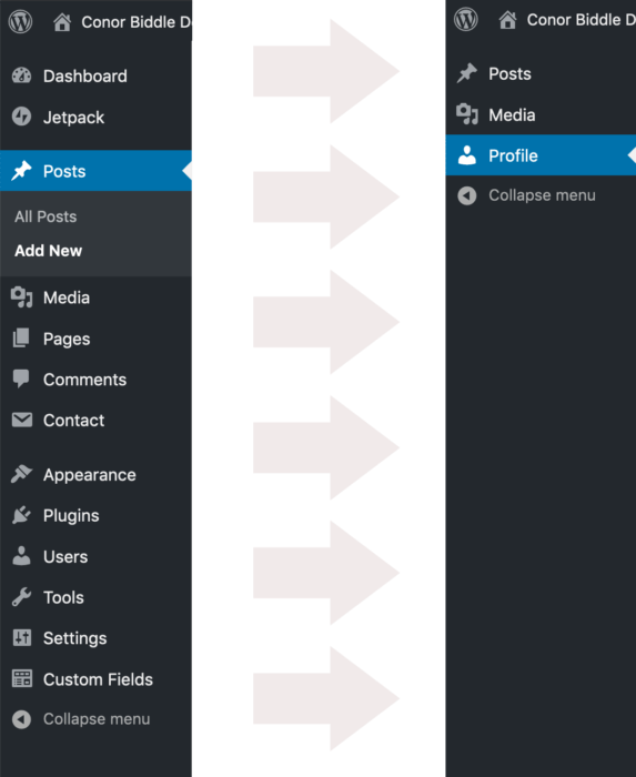
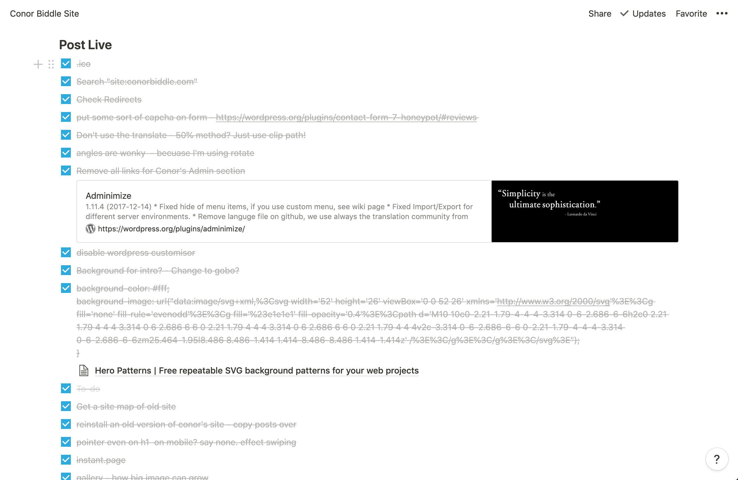
Adminimize
I also came across this plugin called Adminimize (great name!) that can be used to remove options and menu items on a user type basis. So, I’ve set up Conor as an editor – which gives him permissions to create and publish but, because I’m using this plugin, he isn’t presented with all the other site options too. He doesn’t need to see it, so the less clutter, the better. You can see it below.
SEO
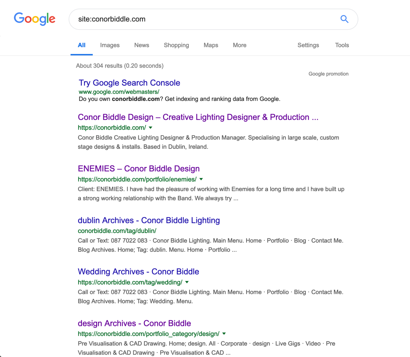
Something I didn’t have too much experience with before was updating an existing site in such a way that effected its sitemap & file structure. Usually I’m used to new builds. So, I had to think about traffic and create a redirection plan. I was in a fortunate position that this is a low traffic site and almost no traffic comes to this site via search. It’s usually direct or through social. So, I could do the best I could but it wouldn’t be a huge issue if everything was redirected.
I looked at Google Analytics and did a site:conorbiddle.com search to see what links Google had picked up on and see if there was an appropriate place I could redirect people to now that those pages were getting the chop. I redirected everything that made sense but, because this site was to be a good bit lighter on content, not all links had a new home. And that’s ok. They’d land at a 404 and Google would learn to remove them from the search results over time. It’d be the wrong decision to redirect all broken links to the homepage.
Notion
Just wanted to mention Notion. I’ve heard it mentioned on a few podcasts etc but didn’t give it a lash until this project. It was super good for tracking things and jotting down ideas as they came to me. If I was on the train or walking in town and remembered there something I had to do, or had an idea, I was able to just not it down on the go. It was very handy indeed.
Lighthouse Audit
I’m getting more and more into performance, filesize, accessibility (as everyone should be) so the last thing to do it to run a Lighthouse audit. It’s built into Chome dev tools now so there’s no excuse not to do it.
I’ve not scored that well (over 80% is generally acceptable) so I know there’s still work to be done.
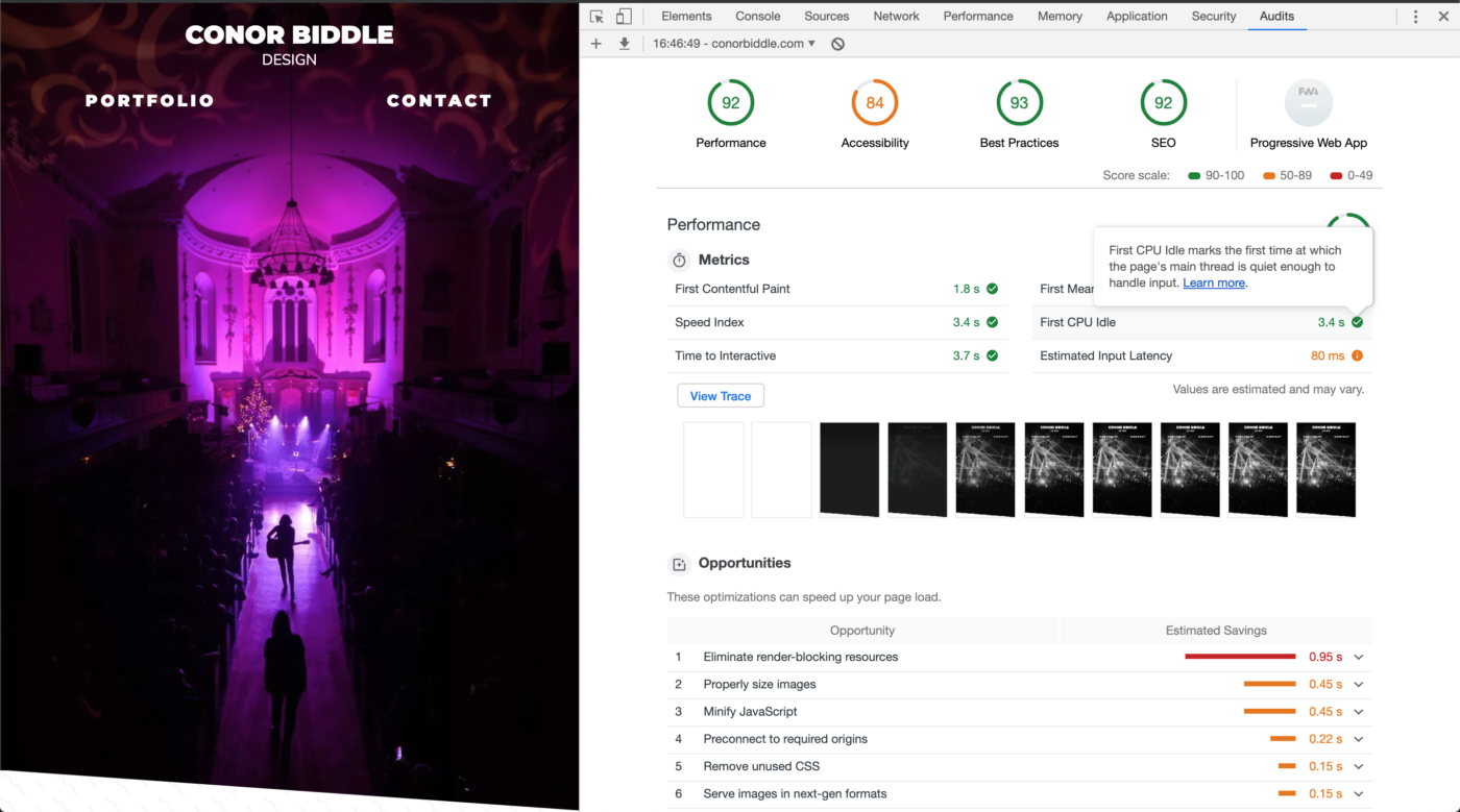
Also, it’s worth mentioning that just because something is 100% on this audit, does not mean things are perfect. Here’s a funny example: Building the most inaccessible site possible with a perfect Lighthouse score.
Still To Do
Nothing’s ever really done is it? There are still some things I want to do to the site to make it even better but I wanted to get a good working version live for Summer, so Conor can actually show people.
Gatsby
I would love to move this to a Gatsby site. I’ve been reading up on and watching tutorials on React but I haven’t done a project using it yet. I think using Gatsby with a WordPress backend would work really well for me as a gateway to full React.
I’d continue to use WordPress as the backend, but seeing as the content isn’t updated frequently, nor is there that much of it so it’s a perfect candidate to make it a Jamstack site. I’d just set up a webhook to run the build command every time a new post is created or an old post is edited.
Images on Desktop
The site was very much built mobile first and in that regard, I’m happy. But I’ve spotted a bit of an issue on large screens where the image become very pixelated. I need to use srcset to have a series of images that can be used for various screen sizes. I know it needs to be done, just a matter of doing it 🙂
Conclusion
So there we are. I’m pretty happy with this overall and it came around pretty quickly when I actually started working on it. I do feel that this is a MVP though but I also feel that that’s OK – I’m set up to keep adding and improving things on the theme and I have it set up so that when I push to Git, the theme automatically updates on the sever too (using deployHQ). This makes tweaking things less cumbersome.

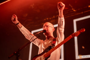
Post by Seán Smyth
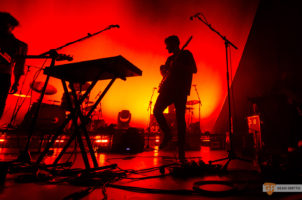
(That's me on the left above there)
I currently work as a Creative Designer & Email Marketing Specialist for Homestay.com. I'm also a Live Music Photographer and Social Manager for GoldenPlec.